
It is the colour of food, war, wine, flags, flowers, luck, love, hate, passion and the blood pulsating through our veins. It is the colour of kings.
It is the colour people adore, it is the colour they fear. Never one of those wishy-washy colours, it will not be overlooked!
It has been used, very effectively, by artists.
 Sir Henry Raeburn
"Patrick Moir"
( 1769 - 1810 )
Oil on canvas 29 x 24 inches
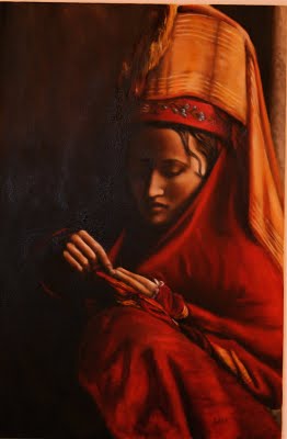
I like to use red in my paintings too. Here is a portrait I painted of an Afghan girl in her traditional garb.

If there is one designer who has an affinity for red, it is that brilliant and fearless Alidad. Simply known as 'Alidad', this is also the name of his design company. He describes his 'look' here. He teams it up with golden, yellow and blue, as well as a multitude of tertiary colours.
 Alidad has been collaborating with Pierre Frey and Chelsea Textiles, designing fabrics in his signature look. The two ranges are so different from one another that they are bound to please any palate.
Alidad has also designed a range of furniture with Thomas Messel (yes, related to the late, great Oliver Messel). Named 'The Velvet Furniture Collection', the designs are based on neo-classical shapes, combining leather and bronze with dramatically studded velvet.
 The furniture is as at home in contemporary homes as period ones. For more detail, click here
The console table, Augustus, was the first design launched. World of Interiors chose it as its Product of the Year in 2004. This table has since been copied in various forms, some painted and even flocked, but none could rival the original.
 The Augustus Console Table is shown in studded red velvet. See the detail on the cabriole here
Less is less and MORE is MORE! Rich colours, opulent patterns and sensuous textures combine to create a feeling of luxury and comfort in a library-come- sitting room.
 Illuminated Verre églomisé is an inspired backdrop for a sumptuous and enchanting dining room.
 Stamped leather walls, a trompe l'oeil coffered ceiling and layers of damask, gilt, crystal and candlelight create a romantic and luxurious dining room. When Alidad was asked to design a charming pied-à-terre in a 17th-century square in the heart of Paris, he decided to create a jewel-like box that would be a feast to the eyes. The rooms are in fact quite modest in size, but by making them as sumptuous as possible, a visitor is tricked into thinking they are bigger.
 When it comes to bedrooms, Alidad is just as bold in his use of colour and fabric.Leather walls are the canvas for a magnificent bedroom with a four-poster bed draped in 18th-century velvet.
 A combination of old fabrics from the 17th, 18th and 19th centuries married with modern textiles in sympathetic hues is the foundation for this glorious yellow drawing room.
 A fabulously overscaled 17th- century tapestry creates drama and interest in this warm, relaxing drawing room.
 A different view...
 And yet another angle...
HOUSE & GARDEN*, the US edition, published the photos of a wonderfully cozy and blissful room, in April 2005. The walls are covered in fabrics from the Mauresque collection from Pierre Frey, as are the furniture. This is a room for cozy conversation and cold winter evenings.
 This image, also from H & G shows Alidad and Thomas Messel in the centre of the box parterre in front of Messel's 16th century manor house in the Cotswolds.
 This image gives a good idea of the scale of the console. It also shows how well this strong red goes with its complementary colour.
Could this English Baroque wingback have been the inspiration for their line of furniture? It 'lives' in the drawing room of Thomas and his wife Pepe Messel.
 The handsome Thomas Messel hard at work in the gazebo...looking very much like the 'English Gentleman'.
In the same issue, Robert Kime's talents are shown off. His rooms are typically put together in a casual way and over several centuries! Most pleasing, Mr Kime used RED, in all the rooms shown. In some, he goes all out, and in some, just a dash of red.
Tonight, enjoy yourself and paint the town...RED!
*Sadly, the US House & Garden magazine ceased publication following the release of the December 2007 edition. Originally founded in 1901, the magazine promised the best in taste, quality and design for your home. This was the second time the magazine has folded -- it was closed in 1993 and brought back in 1996. International editions in Britain, Greece and South Africa will continue to be published.


.jpg)


3 comments:
Of all the red pictures you put up in this post, the one that beats all the rest, hands down, must be your Afghan girl. I am so in love with it!! You know I have seen the picture on your right column for the longest time and each time I visit your blog, I would try to click on the pic to see if I can enlarge it. You should link it to this post, my dear.
You are magnificently talented. I had thought it was a photo. And then I still didn't think you took the photo although I have seen your other blog and thought you an amazingly intuitive and sensitive photographer.
Now I know why.
Lize, I am in awe of your talent!
This post on red is a great read. Not that long ago, I wouldn't have thought I would fall in love with empire, ornate, rococo, baroque. Now, I just want clutter and yes, more is always more.
Hey all, I just registered on this marvelous forum and wished to say hiya! Have a fantastic day!
Good article, thanks! Can you tell us about the second paragraph in more detail?
Post a Comment